WYRM — Personal Brand & Studio Identity
Personal brand and creative studio identity system
Brand Identity • Motion Design • Web Design • Visual Strategy
WYRM — a name inspired by the legendary dragon, symbolizing power, wisdom, and transformation. This is my personal brand and creative studio identity, representing my journey as a motion designer and creative director.
The dragon has always been a symbol that resonates with me — mythical, powerful, and unforgettable. Just like the brands I create for my clients, WYRM embodies strength, creativity, and the ability to leave a lasting impression.
My Mission: "We build brands people remember" — Step by step, we light your brand. I specialize in creating cinematic brand experiences that transform how audiences perceive your business through strategic visual storytelling.
This case study showcases the complete brand identity system I developed for myself, including logo design with the signature T-lockup, visual identity with oceanic color palettes, brand strategy, motion design with character systems, and web presence. Every element was carefully crafted following the principles of simplicity, consistency, and the power of black and white with strategic use of white space.
Brand Identity Guide
Explore the complete brand identity system — logo variations, color palette (White Smoke, Eerie Black, Crimson, Oxford Blue, Royal Blue), typography (SF Pro), and visual guidelines.
Brand Philosophy
Simplicity Rules
Less is more. The logo is designed to be instantly recognizable at all sizes and in all contexts.
Consistent Experience
Every touchpoint maintains the same level of quality and attention to detail.
Embrace B/W Power
The logo should be white on darker backgrounds and black on lighter backgrounds for maximum impact.
White Space as the Continent
Clear space around the logo is equal to the cap height of the "T". Nothing breaks the limit of this space.
Logo System & Typography
T-Lockup
The signature T-lockup creates a distinctive visual anchor for the brand. The interlocking T's form a unique geometric pattern that's both modern and timeless.
- Clear space equal to cap height of "T"
- Nothing breaks the T's created boundary
- Instantly recognizable at all scales
SF Pro Typography
Print + Digital intertwined with Swiss bank sensibilities — strong, safe, and unique. The typeface embodies precision and clarity.
- Light, Regular, Medium, Bold weights
- Swiss-inspired precision
- Digital-first approach
Oceanic Color Palette
The brand palette is important because these colors are unique to WYRM and should be synonymous with the brand. Used sparingly for important moments of support, assurance, delight, calls to action, and especially moments of interaction.
White Smoke
#F5F5F5
Eerie Black
#1A1A1A
Crimson
#DC142C
Oxford Blue
#1F2C5B
Royal Blue
#316CD3
Ocean Blue
#3E88FF
Secondary Gradients
Our secondary colors are gradients that should be used as background imagery for core marketing graphics, creating depth and visual interest while maintaining brand consistency.
Brand Assets & Applications
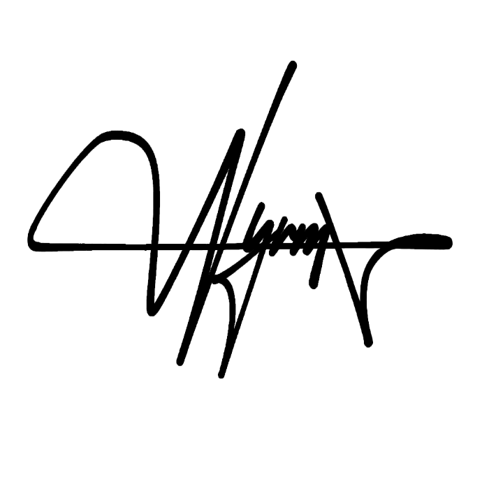
Signature Asset
Adds a personal, human touch that balances the clean digital assets. Great for watermarks or closing frames.
Tagline & Visual Story
"We build brands people remember" — "Step by step we light your brand" paired with the staircase/checkerboard visual tells your story both verbally and visually.
"We build brands people remember"
Step by step, we light your brand
Blue Geometric Corners
Blue geometric corners give you flexible design elements for backgrounds, slides, and templates without cluttering the main mark.
Character System
Blue geometric corners give you flexible design elements for backgrounds, slides, and templates without cluttering the main mark.

Problem
Create a unified brand for a creative studio to showcase collective work and establish a premium market position.
Solution
Complete brand ecosystem: naming, logo, animations, web assets, and motion design system.
Outcome
Full brand system with motion toolkit and cinematic brand film.
Strategy
Inspired by premium studio positioning, the goal was to create a distinctive visual identity that balances creativity with professionalism. The brand needed to signal expertise while maintaining artistic credibility.
Process
Visual System
- Modular logo system with T-lockup
- Signature typography (SF Pro)
- Oceanic color palette
- Blue geometric corner elements
Motion Design
- Brand film animation
- Logo animations
- Character system development
- Transition system
Web Design
- Responsive layout
- Interactive elements
- Cinematic experience
- Signature watermark system
Roles & Credits
Next Case Study